Everydayhero was a charity crowdfunding platform where individuals could fundraise for charities they were passionate about. Fundraisers would share their fundraising pages among friends, family, and others online to help support their campaign by donating. I was the design lead for the team working on the end to end fundraiser and donation flows.
Mobile wasn’t performing
In 2016 we discovered (through our regular data insights team reports) that our mobile donation conversions and average donations was significantly lower on mobile. Also, mobile traffic was increasing. With more people coming from social media links.
There were some obvious potential problems with the existing long donation form. But we to validate those and explore other hypotheses, we started with user testing. Since our audience was a broad range of users that usually had no prior experience with Everydayhero, we used usertesting.com for a fast turn-around.
There were some obvious potential problems with the existing long donation form. But we to validate those and explore other hypotheses, we started with user testing. Since our audience was a broad range of users that usually had no prior experience with Everydayhero, we used usertesting.com for a fast turn-around.
Collaborating on the problems
Now that we had a great idea of the improvement opportunities from user testing we decided to run a Design Sprint to bring in the team and other experts across support and customer success.
We played back key insights, the rest of the team added their own context, and together we landed on our top priority opportunities.
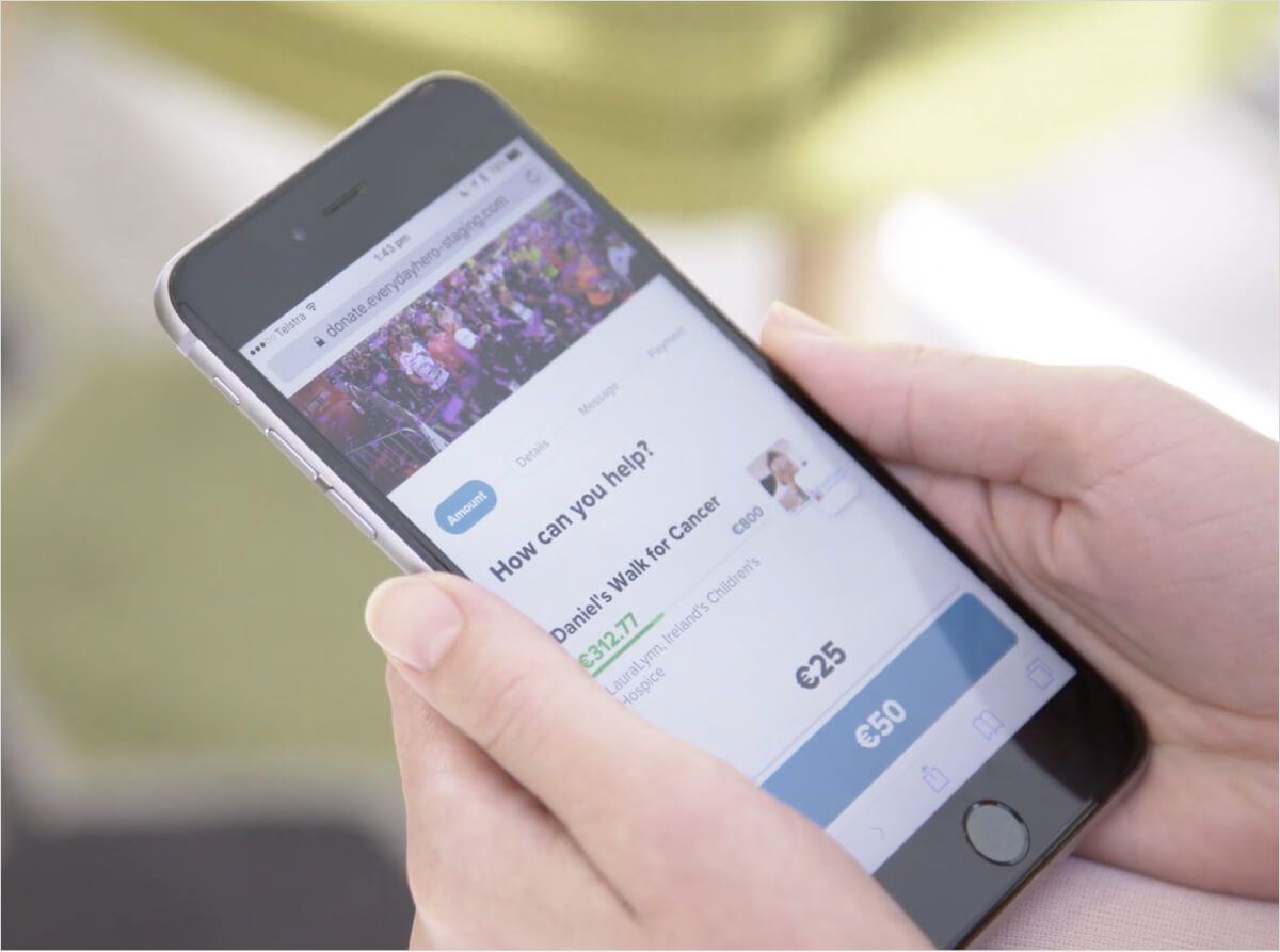
As we ideated together we aligned on some key solutions. But one area we were divided was between a single page or stepped form. Best practices were telling us that focusing on one thing at a time on mobile was the better option. But some thought it was too simple a form for this approach. This was one of the key hypotheses we decided to test.
Testing early and often
We went back to usertesting.com with 2 prototypes and key hypotheses to test. Through testing we discovered that the stepped flow was quicker to understand. It let people focus on one decision at a time, making them feel more comfortable to move forward.
Users were able to blow through some steps quickly, while other steps took a little longer to understand, and therefore they didn’t always make decisions we were optimising for. We used these results to iterate a few more times until we had a solution we were happy to move forward on executing.
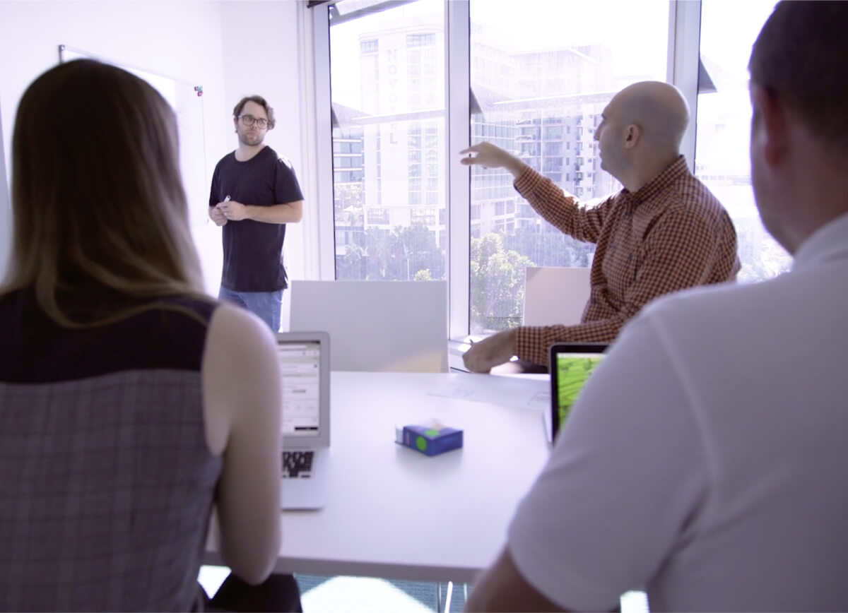
Here I am explaining how we got to the final result.
Nailing the details
Through development there were still many details to work out. Since we were dealing with peoples finances, it was extra important to make them feel safe and confident that everything in the process was exceeding their expectations.
This involved working side-by-side with developers to nail interactions and with QA to ensure we covered every possible configuration of the form and how those details displayed on completion pages, fundraising pages, and receipts.
Measuring success
We were excited to see some immediate results after releasing the new donation form. And not just on mobile (although these had the biggest bump).
- Donation completion rates were up 7%
- Donations increased by 10%
- Opt-in charity communications increased by 40%
These huge results validated our process and how we collaborated as a team. Allowing us to build on it for future initiatives.
Feel free to contact me (details below) for more info on this project. You can also explore more of my work or view my resume.